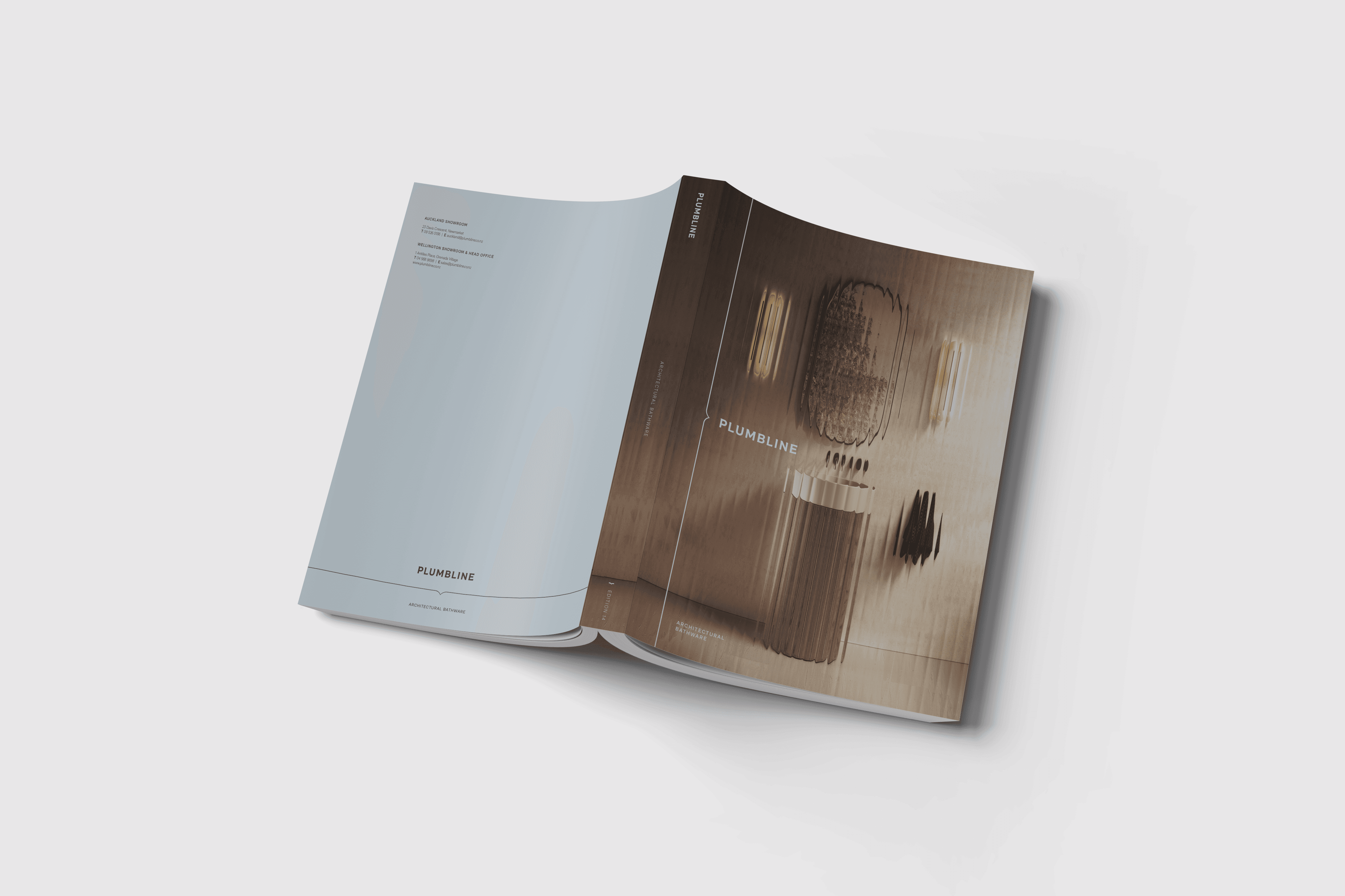
Plumbline
Brand Systems · Print · Digital
Turning Milk NZ's rebrand of an architectural bathware brand into design infrastructure across print, product, digital and internal production.
Diagnose
·
What I inherited
A new identity. No system behind it.
Milk NZ created Plumbline's new identity. I was part of the in-house team responsible for making it work across the business.
The brand arrived with its assets and initial guidelines, but not the structure the business needed day to day: no template system, no lockups for our own touchpoints and a catalogue that had outgrown its structure.

A section of Milk's initial guidelines. We kept the foundations and built our own guidelines and structure from them.
Diagnose
·
What I inherited
A new identity. No system behind it.
Milk NZ created Plumbline's new identity. I was part of the in-house team responsible for making it work across the business.
The brand arrived with its assets and initial guidelines, but not the structure the business needed day to day: no template system, no lockups for our own touchpoints and a catalogue that had outgrown its structure.
A section of Milk's initial guidelines. We kept the foundations and built our own guidelines and structure from them.
Diagnose
·
What I inherited
A new identity. No system behind it.
Milk NZ created Plumbline's new identity. I was part of the in-house team responsible for making it work across the business.
The brand arrived with its assets and initial guidelines, but not the structure the business needed day to day: no template system, no lockups for our own touchpoints and a catalogue that had outgrown its structure.
A section of Milk's initial guidelines. We kept the foundations and built our own guidelines and structure from them.
Diagnose
·
What I discovered
The problem was not the brand. It was the infrastructure.
The identity was strong. What was missing was everything underneath it. The business produced a steady flow of recurring material, but the files behind it had no structure: no paragraph styles, no master pages, no templates and a catalogue grid that couldn't carry the collections.
That made every piece harder to produce, and consistency depended on whoever made it rather than on the system.


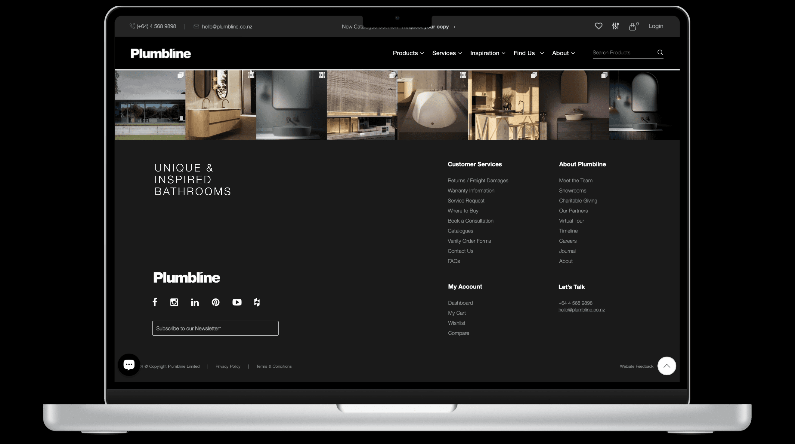
A few of the touchpoints before the rebrand.
Diagnose
·
What I discovered
The problem was not the brand. It was the infrastructure.
The identity was strong. What was missing was everything underneath it. The business produced a steady flow of recurring material, but the files behind it had no structure: no paragraph styles, no master pages, no templates and a catalogue grid that couldn't carry the collections.
That made every piece harder to produce, and consistency depended on whoever made it rather than on the system.
A few of the touchpoints before the rebrand.
Diagnose
·
What I discovered
The problem was not the brand. It was the infrastructure.
The identity was strong. What was missing was everything underneath it. The business produced a steady flow of recurring material, but the files behind it had no structure: no paragraph styles, no master pages, no templates and a catalogue grid that couldn't carry the collections.
That made every piece harder to produce, and consistency depended on whoever made it rather than on the system.
A few of the touchpoints before the rebrand.
Structure
·
What I decided
Put the brand where the team works.
With our guidelines set, I turned them into something the team could use every day. I designed layout lockups for recurring elements like headings and footers, built templates from them and set everything up in a shared Creative Cloud library.
The wider team could then work within the brand without starting from a blank file. Templates covered the recurring commercial touchpoints: project proposals, installation guides, spec sheets and supplier guides.
Opened as a new document, ready to use.
Snapped to the grid, on brand.
Structure
·
What I decided
Put the brand where the team works.
With our guidelines set, I turned them into something the team could use every day. I designed layout lockups for recurring elements like headings and footers, built templates from them and set everything up in a shared Creative Cloud library.
The wider team could then work within the brand without starting from a blank file. Templates covered the recurring commercial touchpoints: project proposals, installation guides, spec sheets and supplier guides.
Opened as a new document, ready to use.
Snapped to the grid, on brand.
Structure
·
What I decided
Put the brand where the team works.
With our guidelines set, I turned them into something the team could use every day. I designed layout lockups for recurring elements like headings and footers, built templates from them and set everything up in a shared Creative Cloud library.
The wider team could then work within the brand without starting from a blank file. Templates covered the recurring commercial touchpoints: project proposals, installation guides, spec sheets and supplier guides.
Opened as a new document, ready to use.
Snapped to the grid, on brand.
Structure
·
What I decided
Rebuild the catalogue, don't restyle it.
The existing catalogue's product grid was out of proportion for the collections, and there were no master pages behind it, so every page was its own layout. Restyling it would have carried those problems into the new brand.
I designed a new 340-page catalogue from scratch, covering thousands of products. I built the grid around the variables each page had to handle, set up master pages for the core layout variations and reused them across the whole catalogue. The same page logic could flex across very different product categories while reading as one publication.


The grid as a spec layout, then set up in InDesign as a master page. A few core variations carried the whole catalogue.
Structure
·
What I decided
Rebuild the catalogue, don't restyle it.
The existing catalogue's product grid was out of proportion for the collections, and there were no master pages behind it, so every page was its own layout. Restyling it would have carried those problems into the new brand.
I designed a new 340-page catalogue from scratch, covering thousands of products. I built the grid around the variables each page had to handle, set up master pages for the core layout variations and reused them across the whole catalogue. The same page logic could flex across very different product categories while reading as one publication.
The grid as a spec layout, then set up in InDesign as a master page. A few core variations carried the whole catalogue.
Structure
·
What I decided
Rebuild the catalogue, don't restyle it.
The existing catalogue's product grid was out of proportion for the collections, and there were no master pages behind it, so every page was its own layout. Restyling it would have carried those problems into the new brand.
I designed a new 340-page catalogue from scratch, covering thousands of products. I built the grid around the variables each page had to handle, set up master pages for the core layout variations and reused them across the whole catalogue. The same page logic could flex across very different product categories while reading as one publication.
The grid as a spec layout, then set up in InDesign as a master page. A few core variations carried the whole catalogue.
Structure
·
What I decided
Fix the structure at the source.
Wherever a product came in several sizes or configurations, the catalogue laid each one out as its own product. Similar items repeated across the pages and were hard to compare.
I proposed restructuring the product data so each product sat as a parent, with its variants listed beneath it. That meant changing the data in Plytix, not just the layout. I set up the fields, received the exported data and brought it into InDesign through EasyCatalog, so the grid held the structure and the data supplied the content. The structure was applied across the whole catalogue wherever products came in more than one version.
In bathroom furniture alone, the Ava Curve Spio collection went from 20 separate product blocks to 12 products, each with its variants beneath.
20 products→12 products
20 products


Before: Ava Curve Spio in the 2024 catalogue, with each size and corner option laid out as its own product. After: the same collection in 2025, grouped by product with options beneath.
Structure
·
What I decided
Fix the structure at the source.
Wherever a product came in several sizes or configurations, the catalogue laid each one out as its own product. Similar items repeated across the pages and were hard to compare.
I proposed restructuring the product data so each product sat as a parent, with its variants listed beneath it. That meant changing the data in Plytix, not just the layout. I set up the fields, received the exported data and brought it into InDesign through EasyCatalog, so the grid held the structure and the data supplied the content. The structure was applied across the whole catalogue wherever products came in more than one version.
In bathroom furniture alone, the Ava Curve Spio collection went from 20 separate product blocks to 12 products, each with its variants beneath.
20 products→12 products
20 productsBefore: Ava Curve Spio in the 2024 catalogue, with each size and corner option laid out as its own product. After: the same collection in 2025, grouped by product with options beneath.
Structure
·
What I decided
Fix the structure at the source.
Wherever a product came in several sizes or configurations, the catalogue laid each one out as its own product. Similar items repeated across the pages and were hard to compare.
I proposed restructuring the product data so each product sat as a parent, with its variants listed beneath it. That meant changing the data in Plytix, not just the layout. I set up the fields, received the exported data and brought it into InDesign through EasyCatalog, so the grid held the structure and the data supplied the content. The structure was applied across the whole catalogue wherever products came in more than one version.
In bathroom furniture alone, the Ava Curve Spio collection went from 20 separate product blocks to 12 products, each with its variants beneath.
20 products→12 products
20 productsBefore: Ava Curve Spio in the 2024 catalogue, with each size and corner option laid out as its own product. After: the same collection in 2025, grouped by product with options beneath.
Deliver
·
What I decided
Bring the brand online before the rebuild.
Rather than wait for the website redesign, I brought the new identity into the existing site. I applied the brand colours and typography across it, and updated the homepage and the Buddy collection page with new layouts, visual treatments and hierarchy, all within what the platform allowed.
The site moved closer to the brand, and the work showed exactly where the old structure ran out. Those limits later helped make the case for a full redesign.

The new identity applied within the existing site, ahead of the rebuild.
Deliver
·
What I decided
Bring the brand online before the rebuild.
Rather than wait for the website redesign, I brought the new identity into the existing site. I applied the brand colours and typography across it, and updated the homepage and the Buddy collection page with new layouts, visual treatments and hierarchy, all within what the platform allowed.
The site moved closer to the brand, and the work showed exactly where the old structure ran out. Those limits later helped make the case for a full redesign.
The new identity applied within the existing site, ahead of the rebuild.
Deliver
·
What I decided
Bring the brand online before the rebuild.
Rather than wait for the website redesign, I brought the new identity into the existing site. I applied the brand colours and typography across it, and updated the homepage and the Buddy collection page with new layouts, visual treatments and hierarchy, all within what the platform allowed.
The site moved closer to the brand, and the work showed exactly where the old structure ran out. Those limits later helped make the case for a full redesign.
The new identity applied within the existing site, ahead of the rebuild.
Deliver
·
What I built
One identity, many commercial contexts.
With the foundations in place, the same system carried across very different commercial contexts: the catalogue, By-Design (a second publication for the luxury collections), project proposals, installation guides and the Merchant Portal interface I designed. Consistent hierarchy, typography, imagery and layout gave every piece continuity, while each could still respond to its own purpose.

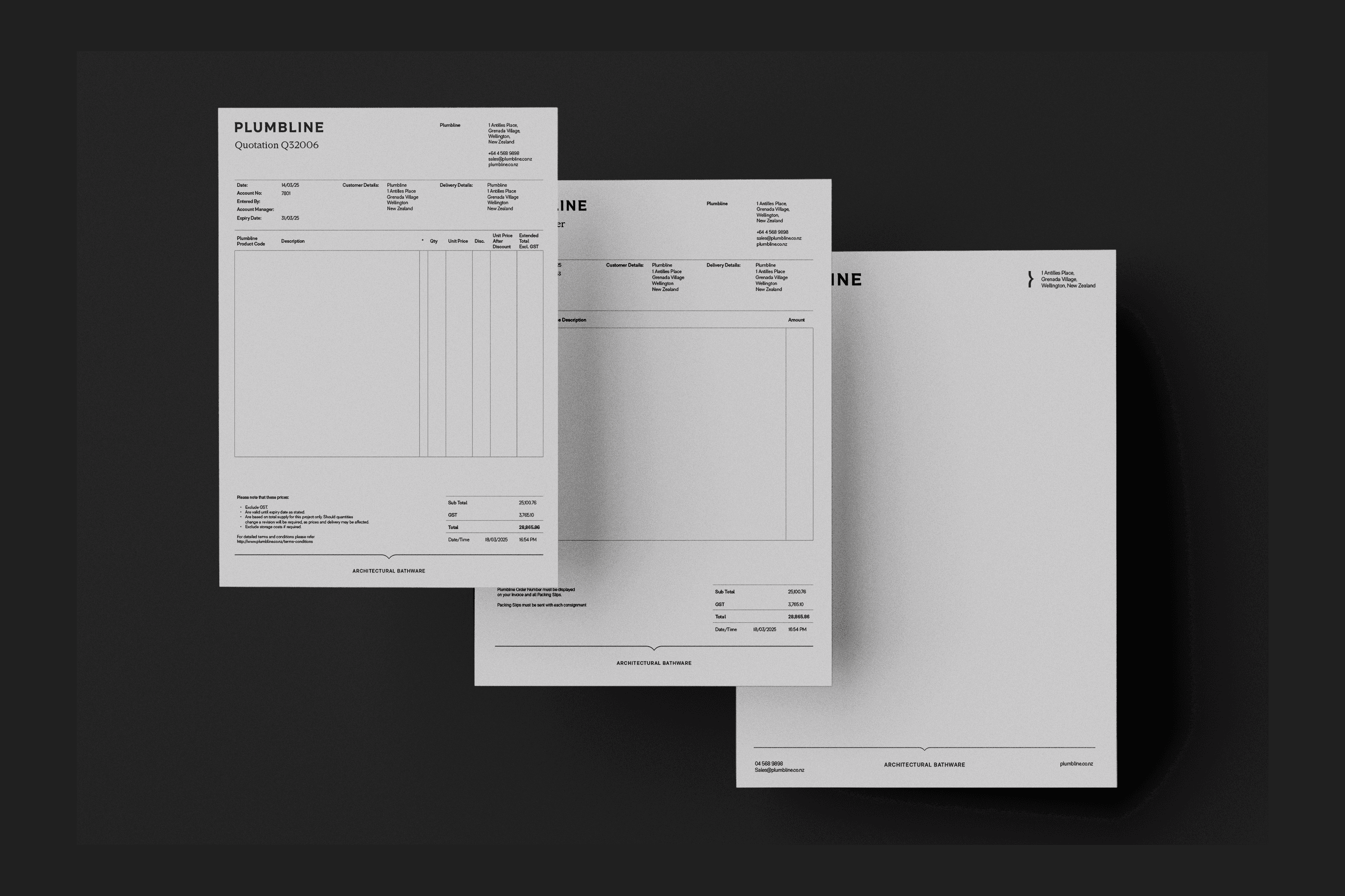


A By-Design spread (branding and imagery refined by Lauren), installation guides, the Merchant Portal and a project proposal.
Deliver
·
What I built
One identity, many commercial contexts.
With the foundations in place, the same system carried across very different commercial contexts: the catalogue, By-Design (a second publication for the luxury collections), project proposals, installation guides and the Merchant Portal interface I designed. Consistent hierarchy, typography, imagery and layout gave every piece continuity, while each could still respond to its own purpose.
A By-Design spread (branding and imagery refined by Lauren), installation guides, the Merchant Portal and a project proposal.
Deliver
·
What I built
One identity, many commercial contexts.
With the foundations in place, the same system carried across very different commercial contexts: the catalogue, By-Design (a second publication for the luxury collections), project proposals, installation guides and the Merchant Portal interface I designed. Consistent hierarchy, typography, imagery and layout gave every piece continuity, while each could still respond to its own purpose.
A By-Design spread (branding and imagery refined by Lauren), installation guides, the Merchant Portal and a project proposal.
Validate
·
What changed
From brand assets to working design infrastructure.
The new catalogue launched on time with the rebrand, and over 2,000 copies were printed and distributed. The same structure now carries the 2026 catalogue, and many of the templates and design structures I set up are still in use across the business.
01.
Guidelines
Before
Initial guidelines from the identity.
After
Layout lockups, templates and a shared library.
02.
Files
Before
No paragraph styles or master pages.
After
Properly built files with styles and master pages.
03.
Catalogue
Before
Every variant laid out as its own product.
After
Parent products with variants, driven by structured data.
Finished catalogue pages, each built on the same grid.
Validate
·
What changed
From brand assets to working design infrastructure.
The new catalogue launched on time with the rebrand, and over 2,000 copies were printed and distributed. The same structure now carries the 2026 catalogue, and many of the templates and design structures I set up are still in use across the business.
01.
Guidelines
Before
Initial guidelines from the identity.
After
Layout lockups, templates and a shared library.
02.
Files
Before
No paragraph styles or master pages.
After
Properly built files with styles and master pages.
03.
Catalogue
Before
Every variant laid out as its own product.
After
Parent products with variants, driven by structured data.
Finished catalogue pages, each built on the same grid.
Validate
·
What changed
From brand assets to working design infrastructure.
The new catalogue launched on time with the rebrand, and over 2,000 copies were printed and distributed. The same structure now carries the 2026 catalogue, and many of the templates and design structures I set up are still in use across the business.
01.
Guidelines
Before
Initial guidelines from the identity.
After
Layout lockups, templates and a shared library.
02.
Files
Before
No paragraph styles or master pages.
After
Properly built files with styles and master pages.
03.
Catalogue
Before
Every variant laid out as its own product.
After
Parent products with variants, driven by structured data.
Finished catalogue pages, each built on the same grid.
Recognised twice in Plumbline's Forward-Thinking awards, for work across the catalogue, the website and the processes behind them.
Plumbline values awards