Follo
Brand Strategy · Identity · Website
Brand strategy, identity, copy and a Framer website for a New Zealand e-bike GPS tracker.
Role:
Brand + Web Designer
Brand + Web Designer
Scope:
Brand Strategy · Identity · Copy · Website Design and Build
Brand Strategy · Identity · Copy · Website Design and Build
Context:
Startup / Product
Startup / Product
Credits:
App interface by Follo's tracking platform. Brand, app icon, copy and website by me.
App interface by Follo's tracking platform. Brand, app icon, copy and website by me.
Diagnose
·
What I inherited
A good product, sold as a device.
Follo makes a hidden GPS tracker for e-bikes and scooters, with live tracking, motion alerts and recovery support. Eric came to me with a brief, an old website and a simple logo.
The product worked. The way it was presented didn't help anyone understand why they needed it.

Follo's previous brand: the original logo on the packaging, app and tracker.
Diagnose
·
What I inherited
A good product, sold as a device.
Follo makes a hidden GPS tracker for e-bikes and scooters, with live tracking, motion alerts and recovery support. Eric came to me with a brief, an old website and a simple logo.
The product worked. The way it was presented didn't help anyone understand why they needed it.
Follo's previous brand: the original logo on the packaging, app and tracker.
Diagnose
·
What I inherited
A good product, sold as a device.
Follo makes a hidden GPS tracker for e-bikes and scooters, with live tracking, motion alerts and recovery support. Eric came to me with a brief, an old website and a simple logo.
The product worked. The way it was presented didn't help anyone understand why they needed it.
Follo's previous brand: the original logo on the packaging, app and tracker.
Diagnose
·
What I discovered
Customers don't buy a tracker. They buy their bike back.
The existing story led with the product rather than the outcome. It wasn't obvious it was a GPS tracker at all, and the things that made it worth buying, like recovery support and motion alerts, were buried behind the technology.
The real tension was between what Follo is and what a rider wants. A rider doesn't want a device. They want to know that if their bike goes missing, they'll get it back.

The previous site, January 2025, via the Internet Archive.
Diagnose
·
What I discovered
Customers don't buy a tracker. They buy their bike back.
The existing story led with the product rather than the outcome. It wasn't obvious it was a GPS tracker at all, and the things that made it worth buying, like recovery support and motion alerts, were buried behind the technology.
The real tension was between what Follo is and what a rider wants. A rider doesn't want a device. They want to know that if their bike goes missing, they'll get it back.
The previous site, January 2025, via the Internet Archive.
Diagnose
·
What I discovered
Customers don't buy a tracker. They buy their bike back.
The existing story led with the product rather than the outcome. It wasn't obvious it was a GPS tracker at all, and the things that made it worth buying, like recovery support and motion alerts, were buried behind the technology.
The real tension was between what Follo is and what a rider wants. A rider doesn't want a device. They want to know that if their bike goes missing, they'll get it back.
The previous site, January 2025, via the Internet Archive.
Structure
·
What I decided
Sell the outcome, not the device.
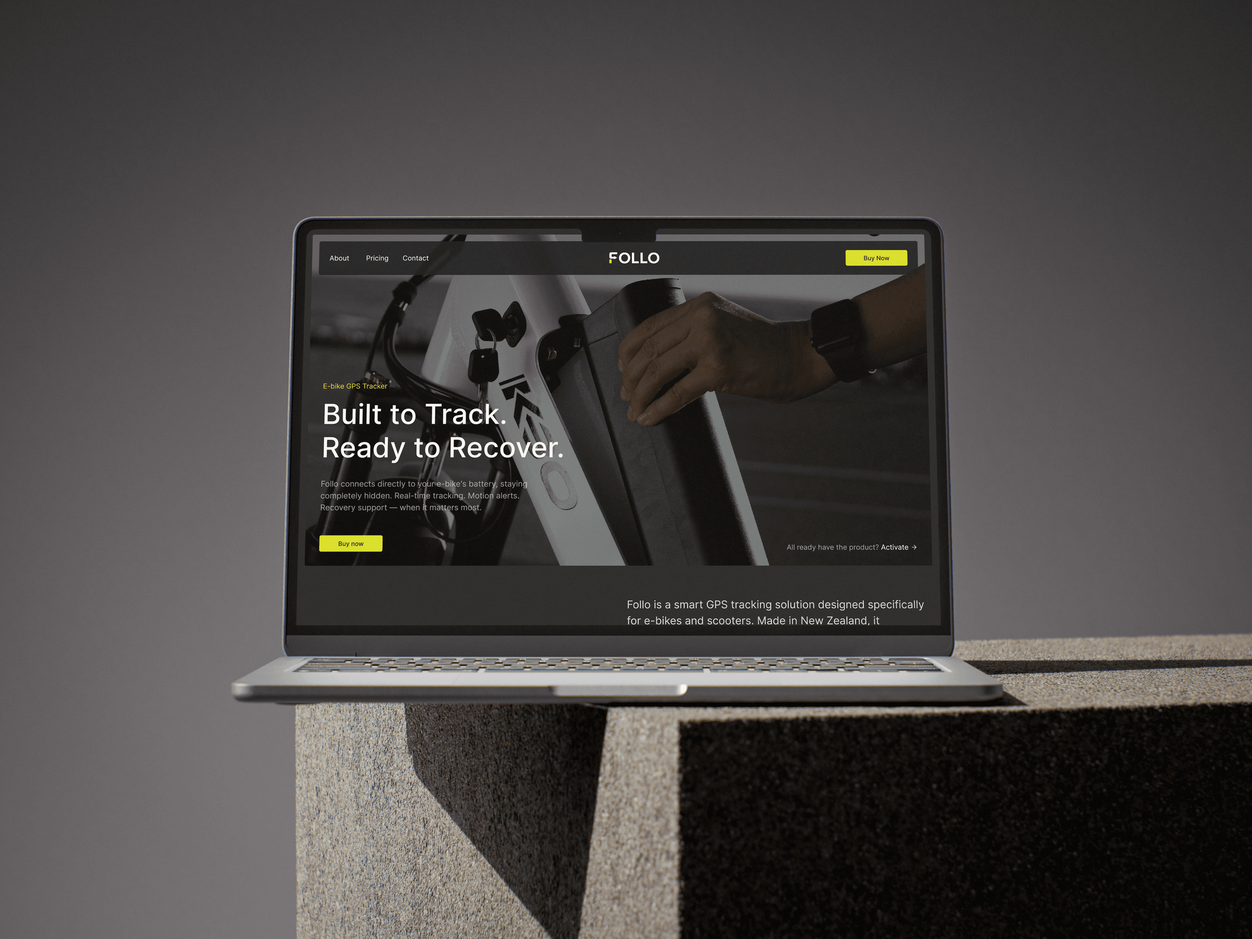
I rewrote the story around recovery. The tagline, "Built to Track. Ready to Recover.", puts the product and the outcome side by side, and every feature on the site now ties back to one promise: getting your bike back, or knowing the moment it moves.

The new hero leads with the outcome, not the device.
Structure
·
What I decided
Sell the outcome, not the device.
I rewrote the story around recovery. The tagline, "Built to Track. Ready to Recover.", puts the product and the outcome side by side, and every feature on the site now ties back to one promise: getting your bike back, or knowing the moment it moves.
The new hero leads with the outcome, not the device.
Structure
·
What I decided
Sell the outcome, not the device.
I rewrote the story around recovery. The tagline, "Built to Track. Ready to Recover.", puts the product and the outcome side by side, and every feature on the site now ties back to one promise: getting your bike back, or knowing the moment it moves.
The new hero leads with the outcome, not the device.
Design
·
What I decided
Put every direction on the table.
I started with broad explorations of the mark, then developed five identity directions, each with its own reasoning, colour palette and app icon. Some explored the obvious territory for a tracker: security, a GPS signal, high-tech colour. Others moved towards movement and direction.
Each one came with the reasoning behind it, so the choice was about what the brand should mean, not just which looked best. Eric chose the direction built on movement, which matched the story: Follo is about where you're going and getting your bike back, not about guarding it.


My first sketches, then two of the directions developed from them: a tracking line in alarm orange and a GPS signal built into the O.
Design
·
What I decided
Put every direction on the table.
I started with broad explorations of the mark, then developed five identity directions, each with its own reasoning, colour palette and app icon. Some explored the obvious territory for a tracker: security, a GPS signal, high-tech colour. Others moved towards movement and direction.
Each one came with the reasoning behind it, so the choice was about what the brand should mean, not just which looked best. Eric chose the direction built on movement, which matched the story: Follo is about where you're going and getting your bike back, not about guarding it.
My first sketches, then two of the directions developed from them: a tracking line in alarm orange and a GPS signal built into the O.
Design
·
What I decided
Put every direction on the table.
I started with broad explorations of the mark, then developed five identity directions, each with its own reasoning, colour palette and app icon. Some explored the obvious territory for a tracker: security, a GPS signal, high-tech colour. Others moved towards movement and direction.
Each one came with the reasoning behind it, so the choice was about what the brand should mean, not just which looked best. Eric chose the direction built on movement, which matched the story: Follo is about where you're going and getting your bike back, not about guarding it.
My first sketches, then two of the directions developed from them: a tracking line in alarm orange and a GPS signal built into the O.
Design
·
What I decided
Turn the chosen direction into a system.
I developed that direction into the full identity. The F becomes a forward arrow, a simple sign of direction and following. Volt green gives Follo energy and stands out in both light and dark settings, and the mark holds up at the smallest size, as the app icon on a rider's home screen.


The final mark, and the type and colour system.
Design
·
What I decided
Turn the chosen direction into a system.
I developed that direction into the full identity. The F becomes a forward arrow, a simple sign of direction and following. Volt green gives Follo energy and stands out in both light and dark settings, and the mark holds up at the smallest size, as the app icon on a rider's home screen.
The final mark, and the type and colour system.
Design
·
What I decided
Turn the chosen direction into a system.
I developed that direction into the full identity. The F becomes a forward arrow, a simple sign of direction and following. Volt green gives Follo energy and stands out in both light and dark settings, and the mark holds up at the smallest size, as the app icon on a rider's home screen.
The final mark, and the type and colour system.
abcdefghijklmnopqrstuvwxyz1234567890
Proxima Nova
abcdefghijklmnopqrstuvwxyz1234567890
Aa
Aa
Aa
Aa
abcdefghijklmnopqrstuvwxyz1234567890
Proxima Nova
abcdefghijklmnopqrstuvwxyz1234567890
Aa
Inter Regular
abcdefghijklmnopqrstuvwxyz1234567890
Aa
Inter Medium
abcdefghijklmnopqrstuvwxyz1234567890
Aa
abcdefghijklmnopqrstuvwxyz1234567890
Proxima Nova
Aa
abcdefghijklmnopqrstuvwxyz1234567890
Inter Regular
Aa
abcdefghijklmnopqrstuvwxyz1234567890
Inter Regular
Aa
Proxima Nova
abcdefghijklmnopqrstuvwxyz1234567890
Aa
Aa
Inter Regular
abcdefghijklmnopqrstuvwxyz1234567890
Aa
Aa
Inter Medium
abcdefghijklmnopqrstuvwxyz1234567890
Aa
Aa
Charcoal Grey
Electric Green
Off Black
Dark Grey
Light Grey
Off White
Structure
·
What I decided
Answer the questions in the order people ask them.
I structured the website around four questions: What is it? How does it work? Why do I need it? What happens if my bike is stolen?
The most confusing part of the product, buying hardware, getting it installed and activating a subscription, became four clear steps. I designed and built the site in Framer.
From the recovery promise to four clear steps.
Structure
·
What I decided
Answer the questions in the order people ask them.
I structured the website around four questions: What is it? How does it work? Why do I need it? What happens if my bike is stolen?
The most confusing part of the product, buying hardware, getting it installed and activating a subscription, became four clear steps. I designed and built the site in Framer.
From the recovery promise to four clear steps.
Structure
·
What I decided
Answer the questions in the order people ask them.
I structured the website around four questions: What is it? How does it work? Why do I need it? What happens if my bike is stolen?
The most confusing part of the product, buying hardware, getting it installed and activating a subscription, became four clear steps. I designed and built the site in Framer.
From the recovery promise to four clear steps.
Deliver
·
What I built
One identity, from home screen to packaging.
The identity carries across the website, the app icon, social posts, large-format advertising and packaging, all designed by me and used by Follo, with the same mark, colour and type throughout. The site takes a rider from the recovery promise, through the benefits and the four steps, to buying the tracker and choosing a plan.


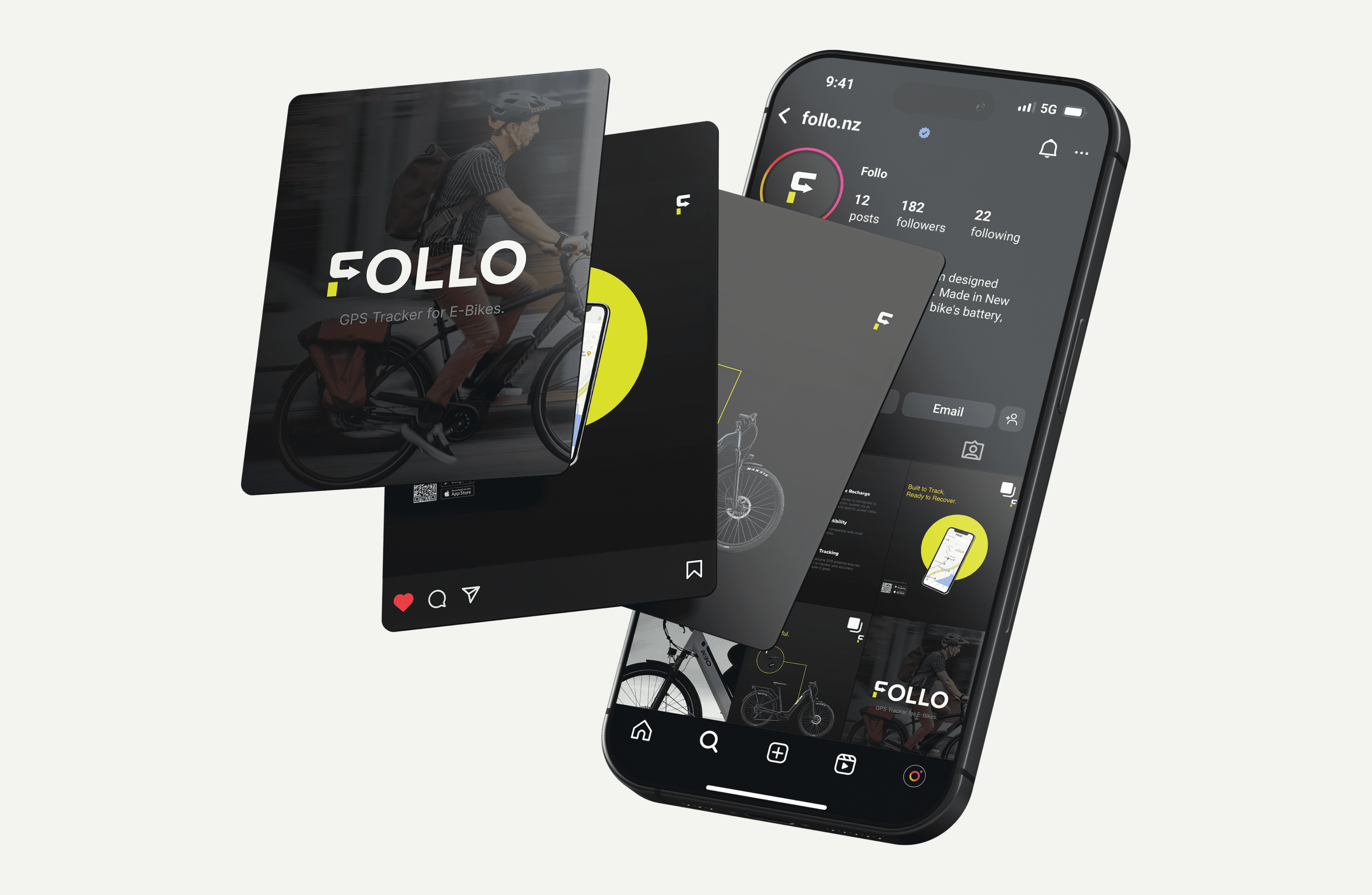
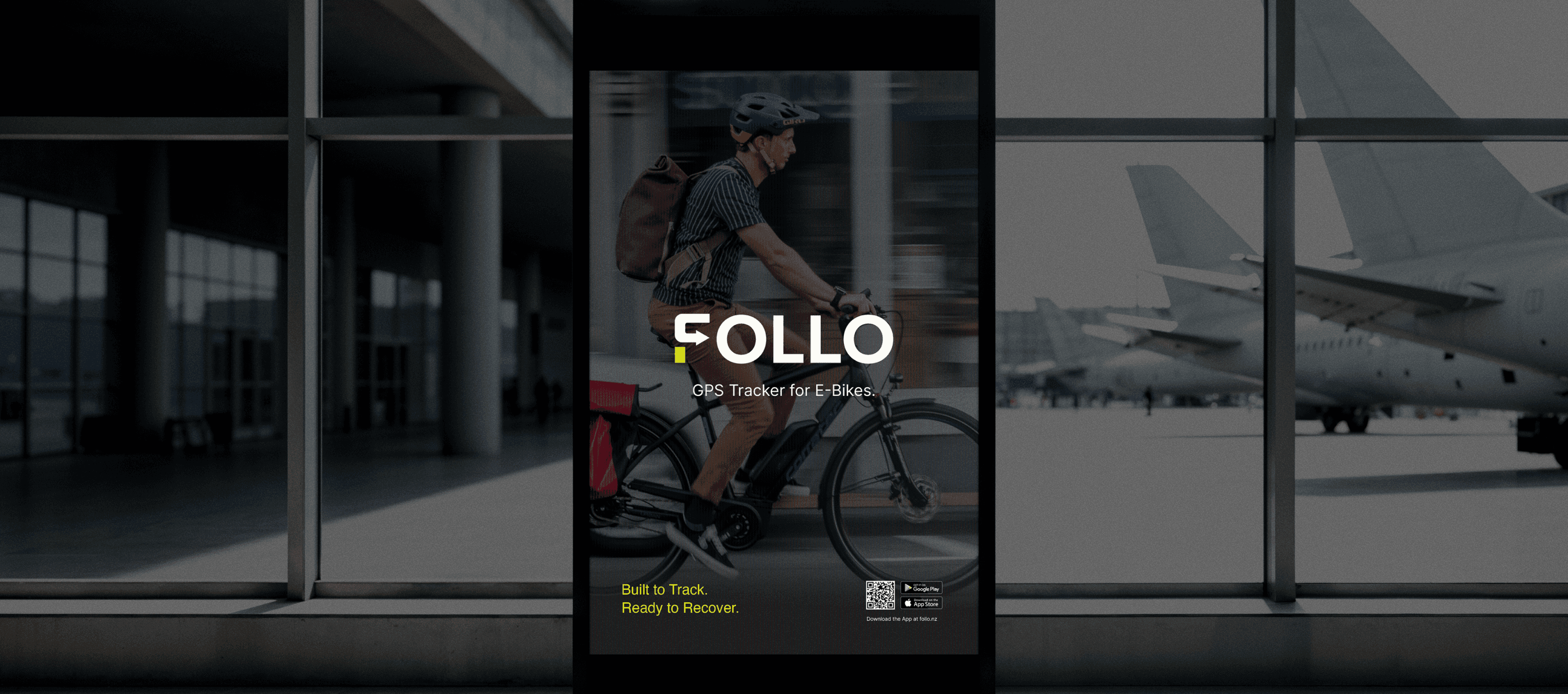
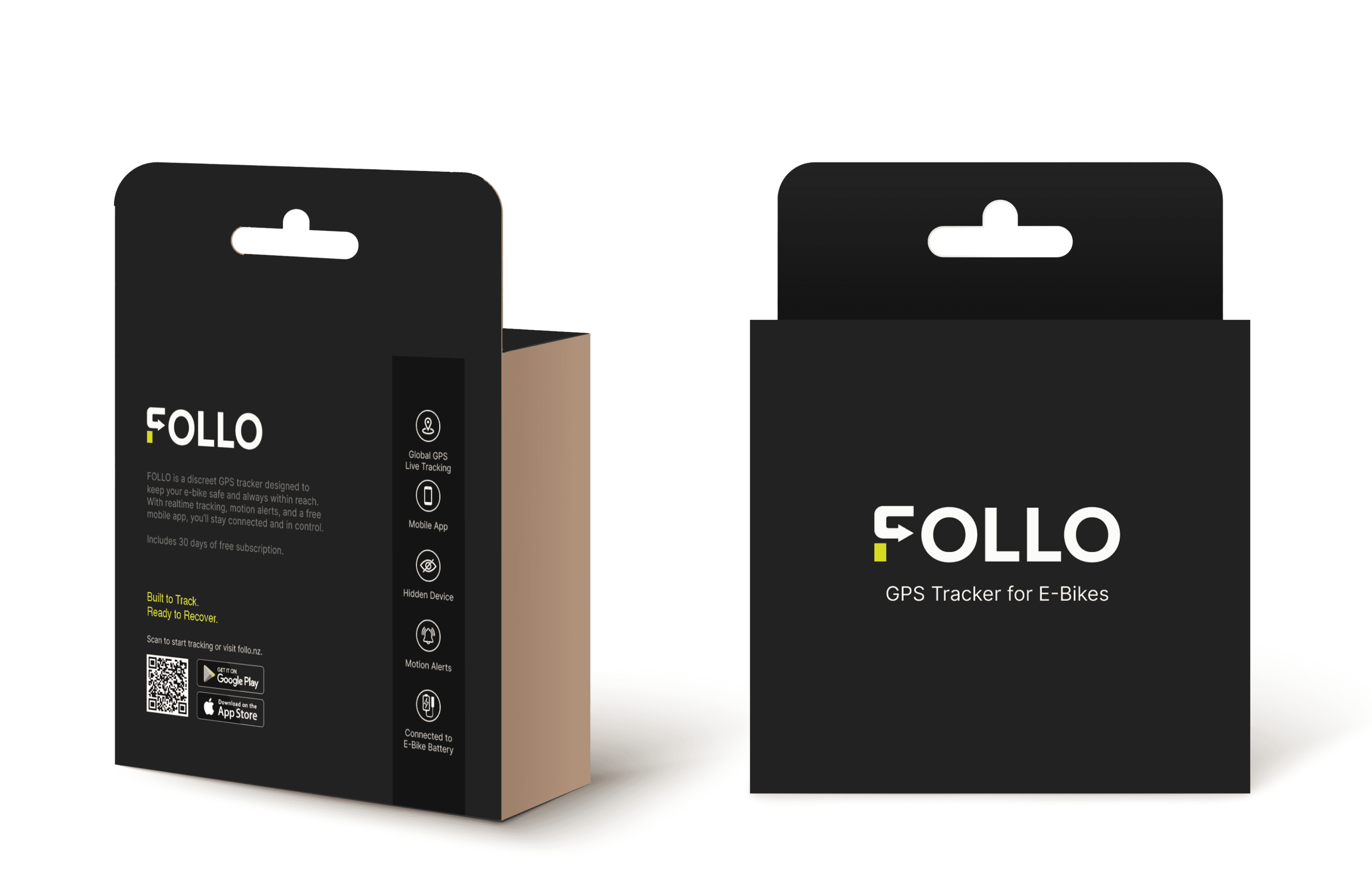
The app download and pricing sections of the site, then social, large-format and packaging designs used by Follo, shown in mockups.
Deliver
·
What I built
One identity, from home screen to packaging.
The identity carries across the website, the app icon, social posts, large-format advertising and packaging, all designed by me and used by Follo, with the same mark, colour and type throughout. The site takes a rider from the recovery promise, through the benefits and the four steps, to buying the tracker and choosing a plan.
The app download and pricing sections of the site, then social, large-format and packaging designs used by Follo, shown in mockups.
Deliver
·
What I built
One identity, from home screen to packaging.
The identity carries across the website, the app icon, social posts, large-format advertising and packaging, all designed by me and used by Follo, with the same mark, colour and type throughout. The site takes a rider from the recovery promise, through the benefits and the four steps, to buying the tracker and choosing a plan.
The app download and pricing sections of the site, then social, large-format and packaging designs used by Follo, shown in mockups.
Validate
·
What changed
From selling a device to selling peace of mind.
The website is live at follo.nz, and the app icon is in use on iOS and Android.
View live site
01.
Story
Before
The device and its specs.
After
The outcome, led by recovery.
02.
Identity
Before
A simple logo.
After
A directional mark with a full colour and type system.
03.
Website
Before
An old site that didn't explain the product.
After
A site structured around customers' questions, designed and built by me.

The live site at follo.nz.
Validate
·
What changed
From selling a device to selling peace of mind.
The website is live at follo.nz, and the app icon is in use on iOS and Android.
View live site
01.
Story
Before
The device and its specs.
After
The outcome, led by recovery.
02.
Identity
Before
A simple logo.
After
A directional mark with a full colour and type system.
03.
Website
Before
An old site that didn't explain the product.
After
A site structured around customers' questions, designed and built by me.
The live site at follo.nz.
Validate
·
What changed
From selling a device to selling peace of mind.
The website is live at follo.nz, and the app icon is in use on iOS and Android.
View live site
01.
Story
Before
The device and its specs.
After
The outcome, led by recovery.
02.
Identity
Before
A simple logo.
After
A directional mark with a full colour and type system.
03.
Website
Before
An old site that didn't explain the product.
After
A site structured around customers' questions, designed and built by me.
The live site at follo.nz.
"I've been very happy with your work for Follo. You'll be the first person I'd recommend and reach out to."
Eric, Follo founder